Priority = very low, just QOL
A star button that a user can press where it will keep all starred suggestions in a certain column for easy access would be a nice addition.
Especially when going back and forth between suggestions, having to remember the users name, or scrolling to find the suggestion takes time and is less efficient.
Starring a suggestion with a gold star button at the top right of a suggestion for example would be useful, and then we can filter by starred to easily access the suggestions for future modifications
I feel like users also can benefit if they want to follow up on certain suggestions, but have to swim through suggestions to find it, especially if many tags get suggested in one day (BootCamp etc.)
Perhaps also can expand in the future to “assign” just like how it is in discourse. For example, lets say @shmuelsash is in charge of duplicates, we can assign a user to that specific suggestion. Or since Andy is well-versed in seizure related topics, we can assign that user and it would ping him.
This can make suggestions organized and users know which to tackle first
Thank you!
We’ve considered doing a “follow up” or “needs community review” sort of filter. Maybe we could do a “maintainer tag” and then maintainers could add tags to suggestions and filter by them?
1 Like
Is there a way to make sure those tags don’t get synced (though we could just make sure to delete them before accepting)
It would probably be maintainer only tags that only we could view, and they would not be attached to the card, just somewhere on the suggestion that indicat/ (basically not green red tags you see on ankihub, it would be somewhere else)
1 Like
Yeah exactly it would be a “maintainer” tag and just attached to suggestions.
Could be:
- in review
- needs community input
- needs more information
Etc
2 Likes
Per the Slack conversation
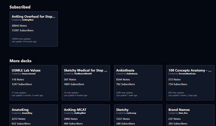
Just thought of something that could improve user experience, I was looking for the MCAT deck (just to check it out) and realized every tile looks the exact same and if I wanted to find a deck id have to control + F
What if every tile could have a really low opacity picture like the one on discourse (the banner), I feel like that would make each tile stand out more and allow for better customizability, could even have little crowns on the top right to signify (AnKing approved)
Just a thought 

1 Like
An assign feature would be great for delegating suggestions and keeping the queue short

