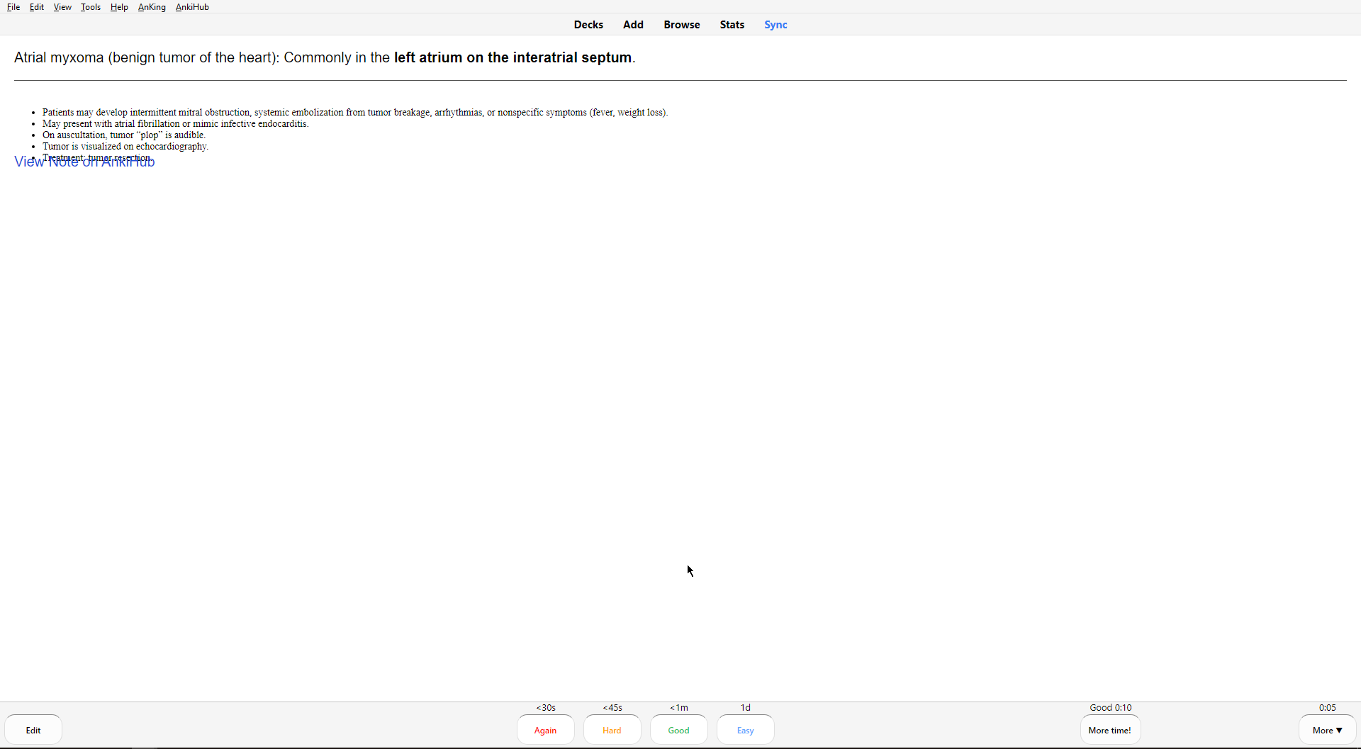
Upon collaborating the new FACK’23 Key Facts deck, I have noticed some of my cards that have images/text are not aligning properly with the “View Note in AnkiHub” hyperlink.
Not sure how I should approach this. Any suggestions? See attachments for reference.
Should I be adding a padding/space between the Back Extra field? Issue occurs in both images/texts. If so, how would you recommend me to approach this? Thank you!
Have played around by using
& a:link, but seems they are not working or I may have the CSS styling wrong.
Solved using the following in styling. However, not too sure if this will be maintained across various users. Please do let me know if this is solved across others as well!
a:link, a:visited {

background-color: #cde3f8;

position: fixed;

bottom: 10px;

right: 10px;

color: black;

padding: 5px 20px;

display: inline-block;

border-radius: 50px;

font-size: 10px;

}

a:hover, a:active {

background-color: #ebf3fa;

position: fixed;

bottom: 10px;

right: 10px;

font-size: 10px;

}
1 Like